How to make the iPad more like a Mac without making it less like an iPad - Ars Technica
 Enlarge / The iPad Pro is a good start, but iOS needs to get better for it to realize its full potential. Andrew Cunningham Last week, Apple announced its plans for iOS 9.3. It's surprisingly ambitious for a point update, hearkening back to the days of iOS 4.x where these smaller mid-cycle updates could be expected to do more than fix bugs or support new hardware and services.
Like the larger iOS 9 update, iOS 9.3 also introduces a big and possibly game-changing feature for iPads, at least if you're in education: a true multi-user mode. This feature is exclusively for schools right now, and Apple tells us that there's no way for standard users to enable it to try it out for themselves. I wouldn't expect that to last forever, though—it's likely that the feature will roll out to the general public as part of iOS 10 or some future update after Apple has some real-world usage data and time to fine-tune.
All of the new features introduced in iOS 9.x (plus the iPad Pro) point to Apple's intentions for the iPad, which still sells fairly well but has experienced a steady year-over-year sales slide for every quarter since early 2014. Like the iPhone, the iPad will continue to be a touch-first platform that assumes you're using the touchscreen as the primary method of input, but it will continue to pick up more "computer-y" features that make better use of its larger screen and more powerful internal hardware.
With that in mind, here are a few iPad-specific feature requests for iOS 10, all of which balance the iPad's traditional strengths and the needs of people more used to "traditional" desktop OSes.
A better multitasking switcher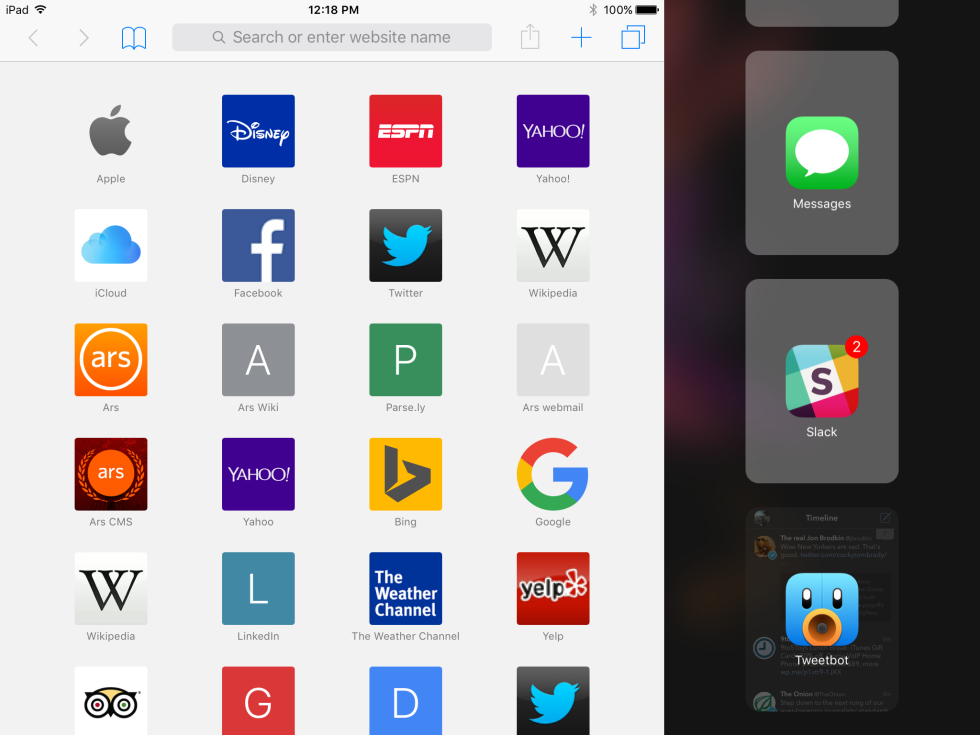 Enlarge / The iOS 9 Split View app switcher (right) leaves a lot to be desired. It doesn't make great use of the space, and you need to do lots of swiping. Andrew Cunningham Further Reading
  The three-year journey to multitasking and resolution-independence in iOS 9
 Auto Layout, size classes, and the other features developers should be using now.
I complained about this in our iPad Pro review, and I'm here to complain about it again: the Slide Over/Split View app switcher in iOS 9 needs work. If you're confused about the differences between Slide Over and Split View, we've outlined them here, but in short Split View is the "true" multitasking mode supported only on the iPad Air 2, Mini 4, and Pro.It's mainly a problem for heavy users who switch between many apps. As-is, the switcher only displays apps three at a time in the order in which they were used, and, if you need to find a new app or something you use less frequently, you have to do a lot of scrolling. More annoyingly, you need to first bring up Slide Over before you can switch to Split View mode, but the list of recently used apps for Slide Over and Split View is maintained separately—an app you use all the time in Split View mode might be buried halfway down the list in Slide Over mode.
The information density of the current switcher is also poor. Icons are large, but only the most recently used app shows you a thumbnail of what you were doing in that app.
One app, multiple instances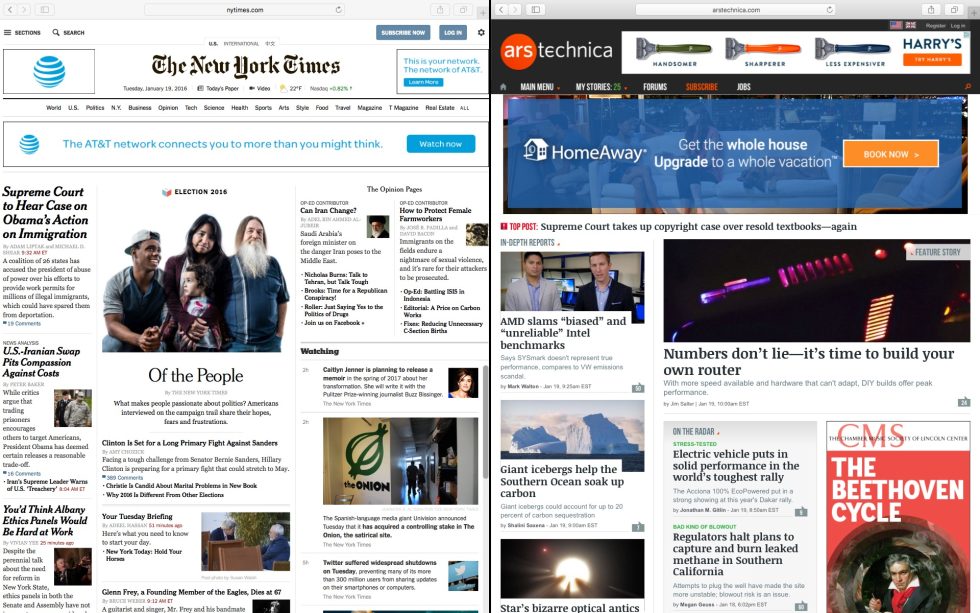
Andrew Cunningham
Running two Safari windows side-by-side is something you can do in OS X.

Andrew Cunningham
Running two Safari windows side-by-side is something you can do in OS X.
Andrew Cunningham
In iOS, your best bet is a workaround like "Sidefari" or running two totally separate browsers, side by side.
Almost every app on an iDevice can only run a single instance of itself at a time—the main exception is Safari, which opens a new process for every page you load, and even that is more about process isolation than it is about multitasking.
In any case, you can't launch more than one app "window" in iOS at once. Up until four months ago, that didn't matter, because the OS didn't allow you to pull up multiple windows in the first place, but now it feels particularly restrictive not to be able to open two Word documents or Safari pages up side by side (crafty apps like "Sidefari" get around the latter problem by using iOS 9's new Safari Web views to effectively open a second Safari window next to the main one. It's an ingenious workaround, but it shouldn't be necessary).
Ideally, the iOS 10 version of Split View would work just like the OS X version does now—you can easily place a couple of Chrome or Word or Safari windows next to each other on Apple's desktop platform. Along with an improved UI for managing multiple app windows at once, being able to open up multiple instances of the same app will go a long way toward making the iPad a more versatile productivity machine.
The easiest answer to the problem is to either make this multitasking switcher more like the Home screen—either add a static, user-configurable dock of apps to the bottom of the switcher or make the gigantic icons in the current switcher Home screen-sized so you can find them more easily. There may be more elegant solutions, but this would at least have the benefit of being usable.
Mouse pointer and trackpad support
Andrew Cunningham
Holding down two fingers on the software keyboard on an iPad gets you a big virtual trackpad—why not extend that to hardware accessories?

Andrew Cunningham
Holding down two fingers on the software keyboard on an iPad gets you a big virtual trackpad—why not extend that to hardware accessories?

Andrew Cunningham
The Smart Keyboard isn't bad, really.

Nathan Fitch
...but it's hard not to wonder what Apple could do with a Surface-esque trackpad.
iOS can and should remain a finger-optimized, touch-first platform, but Apple already tacitly admits that there are some cases (namely text editing) where a more precise mouse cursor is preferable to a big fat finger. Hold down two fingers on the iPad software keyboard or Force Touch the iPhone 6S' software keyboard to turn that section of your screen into a virtual trackpad that lets you move that cursor where ever you want it.
For iOS 10, Apple should extend that functionality to encompass hardware trackpads. You feel the need for one the most when using a keyboard case like Apple's Smart Cover with the iPad—it just feels counterintuitive to have to move your hands from the keyboard to the screen and back if you're trying to scroll through something.
Basic Bluetooth mouse support would be good; full trackpad support would be even better. Many of the multitouch trackpad gestures in OS X already do iOS-ish things like swiping from one full screen or Split View app to another, and both inertial scrolling and the "elastic" rubber-band scrolling debuted in iOS and were moved over to OS X later. The basic groundwork is already laid. Apple could support these features for iOS users with keyboards without making the iPad any worse for those who use it as a pure tablet.
Consumer-ready multi-user mode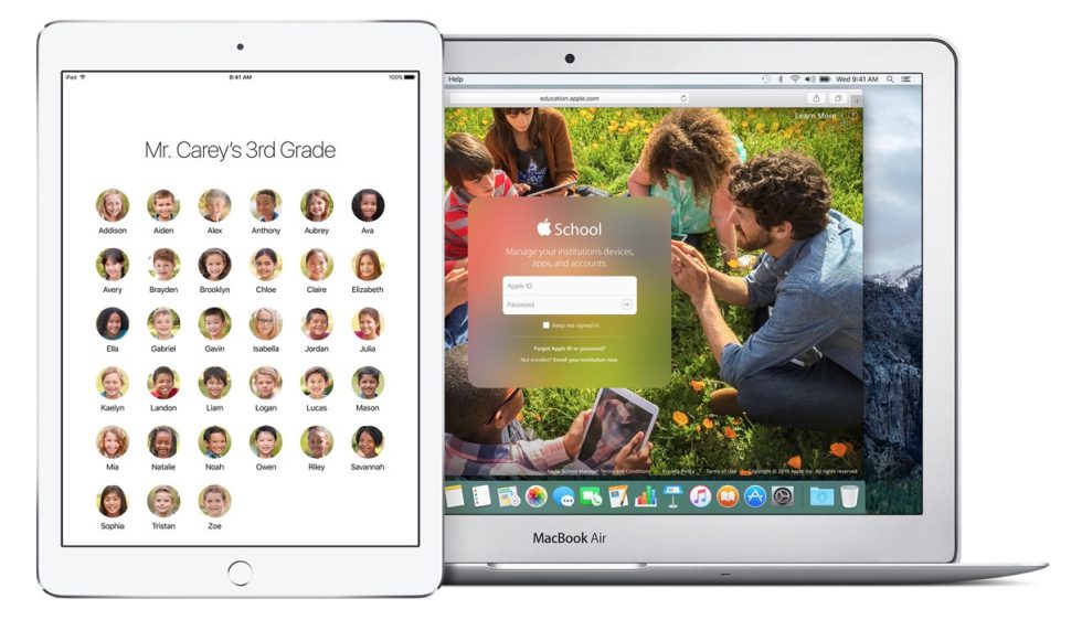
Apple
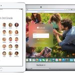
The multi-user mode Apple is releasing in schools could be the first step toward a consumer-ready multi-user mode.
Apple
The multi-user mode Apple is releasing in schools could be the first step toward a consumer-ready multi-user mode.

Apple
The "Classroom" activity monitoring app could be useful as a parental control option for families.
Multi-user mode for schools means that Apple is almost certainly working for a multi-user mode for the general public. It's been a longstanding feature request of ours, since tablets are much more likely than phones to be passed from person to person.
A consumer multiuser mode could be tied to Family Sharing accounts the same way iOS 9.3's multiuser mode is tied to educational accounts; this way you wouldn't have to buy and install most apps separately for separate accounts. Fingerprints registered to TouchID could be tied to different accounts to automate login.
Storage space could become an issue, especially for 16GB iPads. Apple's solution for this in schools is to download students' content to their tablet the first time they log in to a new one, but families (especially those with slower Internet) aren't going to want to wait for that to happen every time they log in. If Apple can figure out how to juggle those resources, multi-user mode is a no-brainer.
The little thingsThose big things would all make a big difference, but there are little things throughout iOS that Apple could change to make it a more tablet-friendly operating system.
Spruce up and simplify setupiOS' setup wizard has gotten truly ridiculous as Apple has added features—it wants to know your region and language, Wi-Fi settings, your Apple ID and iCloud settings, your passcode and Touch ID settings, Siri settings, display zoom settings (on the iPad Pro and newer iPhones), whether you want to share information with Apple and developers. Individually, none of these questions is a big deal. Taken all together, they make first-time setup a lengthy chore.
Also, the setup wizard on the iPad doesn't support landscape mode. It's not a huge deal, but, especially for the iPad Pro, it feels like an oversight.
Fix Split View's rough edges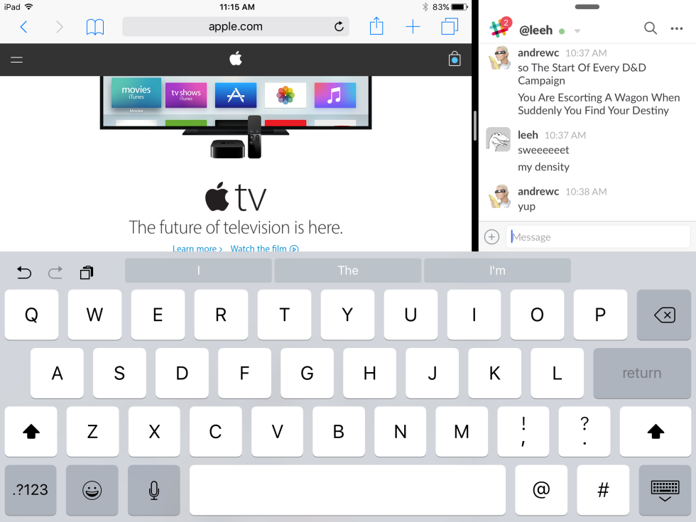
Andrew Cunningham
When the secondary app (the one on the right) has focus, the text entry field is visible and usable.
Andrew Cunningham
When the secondary app (the one on the right) has focus, the text entry field is visible and usable.
Andrew Cunningham
When the primary app has focus, the text entry field is hidden—you need to hide the keyboard entirely and then tap on the field to use it.
The iOS software keyboard (or the standalone formatting toolbar, if you're using an external keyboard) can be a pain to use with certain apps. The toolbar can obscure the bottom part of the app that you aren't actively using, which is irritating because many messaging apps (including Slack, Facebook Messenger, and the built-in Messages app) put their text input field right at the bottom of the screen. I frequently use the "main" window for an app like Safari or Word and the "secondary" app window for communication, so I run into this a lot.
Let apps that don't have focus acknowledge the existence of the software keyboard and/or formatting bar, and the problem goes away.
Dark ModeI've wanted something like this in iOS since I've been a user of iOS, but I've wanted it even more since iOS 7 introduced the current, bright, white-heavy design.
iOS needs to follow OS X in adopting a Dark Mode theme that tones that harsh brightness down. For some, it's simply an aesthetic preference. Others want something that's easier on the eyes in dim light. And for some, as others have argued, it's a handy accessibility feature.
Nobody's asking for an iPad that can do everything a Mac can do, but there are things I actually enjoy about working on the iPad that still need to get better. Apple's tablets are nice big screens that switch capably from tablet-mode-leisure-time apps like Kindle and Netflix to work-mode-productivity-time apps like Word and Slack. It works well with fingers, and it's working increasingly well with other input devices. With just a few more changes, iOS 10 could complete the transformation that iOS 9 started, and the tablet could shake those "big iPhone" jokes once and for all.

0 komentar